Candace Shamieh

Yoann Moinet

Derek Howles

Rachel White
Before we started using Datadog Real User Monitoring (RUM), we relied on frontend logging to gather data about the user experience. Logs gave us some helpful information about exceptions and errors but didn't provide any insight into issues directly related to the user’s perspective.
While we still use Datadog Log Management to monitor specific use cases and perform extensive analysis of our frontend environment, adding RUM to our observability toolkit enabled us to make meaningful changes to our UI that directly improved the user experience. RUM combines real user analytics with performance data, so we know exactly how users interact with our application and how each change impacts them.
In this post, we’ll discuss how the rich visibility that RUM provides led us to improve our UI in tangible ways, including:
- Helping us obtain raw, unbiased feedback from users
- Providing insight into user interactions and feature adoption
- Revealing the variety of browsers and devices that customers use
Minimizing the risk of feedback bias with RUM’s Session Replay
We exercise a data-informed approach whenever we make changes to our UI. We prefer the term “data-informed” over “data-driven” because we don’t just use data to guide our decisions—we also solicit feedback from our customers through a variety of mechanisms, including:
- Direct conversations: Datadog employees who are in customer-facing roles, like account executives, sales engineers, and technical account managers, relay customer feedback to the engineering teams that own a service.
- Product research tools: We survey customers using tools like Ballpark.
- Strategic design partnerships: We identify a group of customers that heavily use one of our products and initiate a customer feedback loop as we develop a new feature. They provide us with feedback on early versions of the feature, we iterate upon it, and then follow up with them directly to share how their insights influenced the end result.
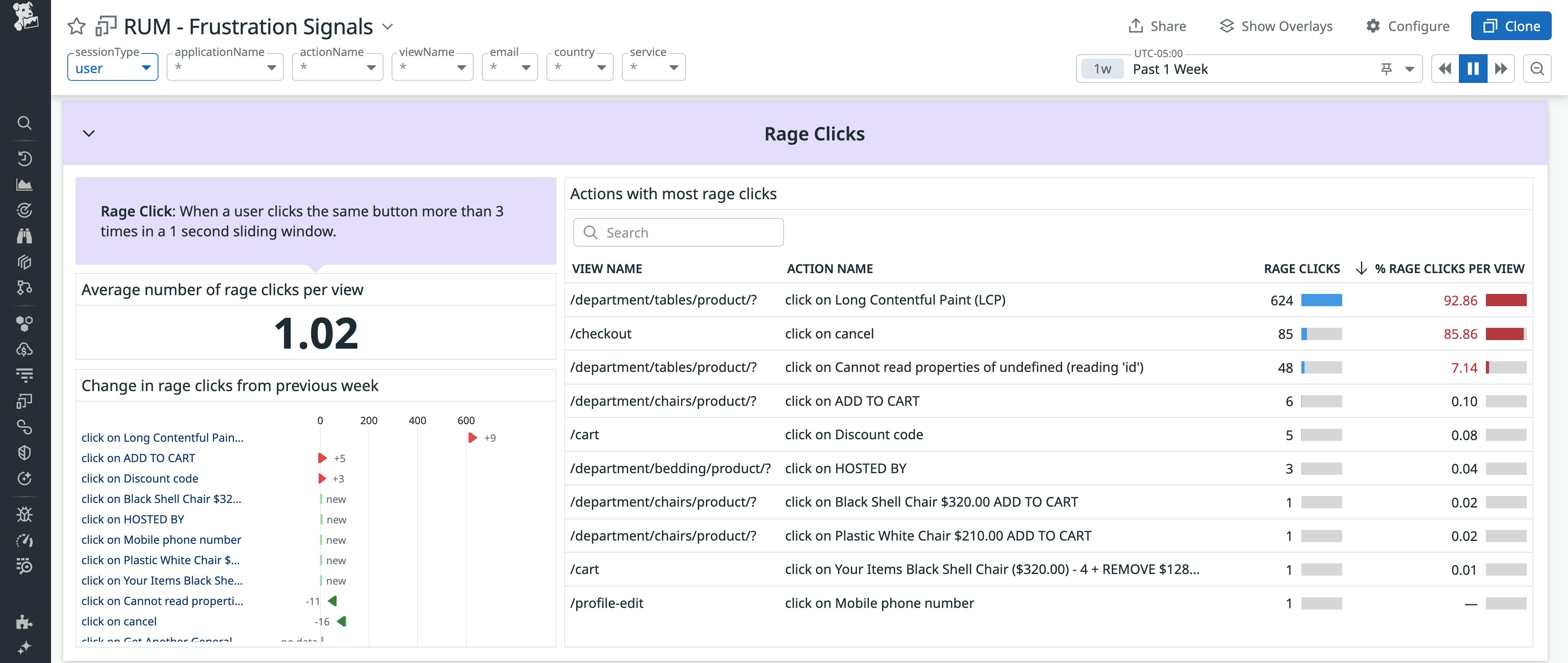
Direct conversations, product research tools, and design partnerships are valuable feedback mechanisms that enable us to continuously improve our products; however, they also carry an inherent risk of unconscious bias. With RUM’s Session Replay, we gain an “unfiltered” view into how customers interact with our UI, enabling us to capture unbiased feedback as we experience it from their perspective. This feedback helps us identify and gain an in-depth understanding of their goals, desires, and frustrations. For example, if a frustration signal is detected—such as rage clicks, dead clicks, and error clicks—we use Session Replay to review the associated user journey end-to-end. This enables us to pinpoint the root causes faster.

Session Replay also helps our Technical Solutions team gather feedback to improve the UI. When a customer submits a ticket, the team is the first to respond—but missing context can hinder troubleshooting. If a customer can't re-create the issue or is unable to share files due to their organization’s security policies, they can permit the team to review their sessions using Session Replay. To maintain privacy, we mask all text by default and only replay the sessions that align with the timeframe in which the issue occurred.

Once resolved, the Technical Solutions team relays this feedback to the frontend engineering team, explaining the circumstances surrounding the customer’s issue.
Using RUM to inform feature development and track adoption
RUM provides tangible insight into user behavior, helping us navigate user journeys, track user actions, detect and analyze frustration signals, and replay user sessions. Understanding user behavior enables us to evaluate how users are adjusting to, or interacting with, our features, and provides us with the information we need to make engineering decisions that optimize user experience. To illustrate, we’ll cover how RUM enabled us to confirm a hypothesis during the planning phase of Quick Graphs and to track adoption during the deployment phase of Quick Search.
Enabling users to graph from anywhere with Quick Graphs
The idea to develop Quick Graphs came as a direct result of customer feedback and RUM’s insight. Customers voiced that they couldn’t find the dashboard that they needed within our large library of out-of-the-box dashboards. Often, customers would have a question about a specific dataset, but our dashboards tend to provide comprehensive overviews of applications, infrastructure resources, and other components.
We had a hunch that customers were creating temporary dashboards to avoid spending time hunting for the visualization they needed. Our hypothesis was that these temporary dashboards were never intended to become a permanent part of their troubleshooting workflows. Session Replay helped us confirm this by enabling us to review user journeys where customers created custom, single-use dashboards that were abandoned after they served their purpose. In RUM’s Session Explorer, we identified sessions in which users created a new dashboard shortly after navigating to the Dashboard List page. We filtered these sessions based on dashboard creation events and used Session Replay to observe user flows in detail—watching how users added one or two graphs, viewed them briefly, and then exited the dashboard. To determine whether these dashboards were truly single-use, we corroborated what we saw in Session Replay by cross-referencing with RUM user actions, which confirmed that many of the dashboards were never accessed or edited again after their initial creation. Some of them were deleted altogether. Together, RUM and Session Replay helped us confirm that users were frequently building temporary dashboards to answer focused, time-sensitive questions—and that a lighter-weight, in-context graphing tool could better support this workflow. This led us to develop Quick Graphs, which enables users to create a graph from anywhere in the Datadog application, avoiding the need to create an entire custom, single-use dashboard.

Quick Graphs lets customers quickly answer specific questions without searching for dashboards or creating temporary ones, offering faster access to graphing from anywhere in the app.
Tracking feature adoption with custom RUM dashboards
As we add more products and features to our platform, we wanted to help users quickly find what they need. We knew that Cmd + K was a common software pattern across web and native applications, so we developed the Quick Search feature. To gauge the success and efficacy of Quick Search, we created a RUM dashboard to monitor usage. Tracking new feature adoption enables us to know which customers are the best to ask for feedback, including power users or those that are hesitant to use the capability.
Once we saw how effective the custom RUM dashboard was in providing visibility into Quick Search usage and adoption, we started to implement this practice as a standard part of our post-deployment workflow. For example, we created a RUM dashboard to track usage of a new Datadog Cloud Cost Management (CCM) budgeting feature. The dashboard includes engagement metrics that track page performance, including page views and number of unique users visiting a page, browser usage, user actions (such as the number of users that take action after viewing a page), and feature usage (such as the number of organizations that have created a budget and view it monthly).

The dashboard also reports other RUM user interactions, like the number of clicks on a View button, and page performance metrics such as loading time, which evaluates a full-page load time from the user’s perspective. Having this RUM telemetry available at a glance provides us with a solid starting point to investigate why users may not be adopting a new feature immediately.
We also use these dashboards to track OKRs that are tied to feature adoption and performance. We can quickly see whether or not we’re projected to meet the OKR, and intervene early to drive adoption when necessary.
Using RUM to guide frontend modernization
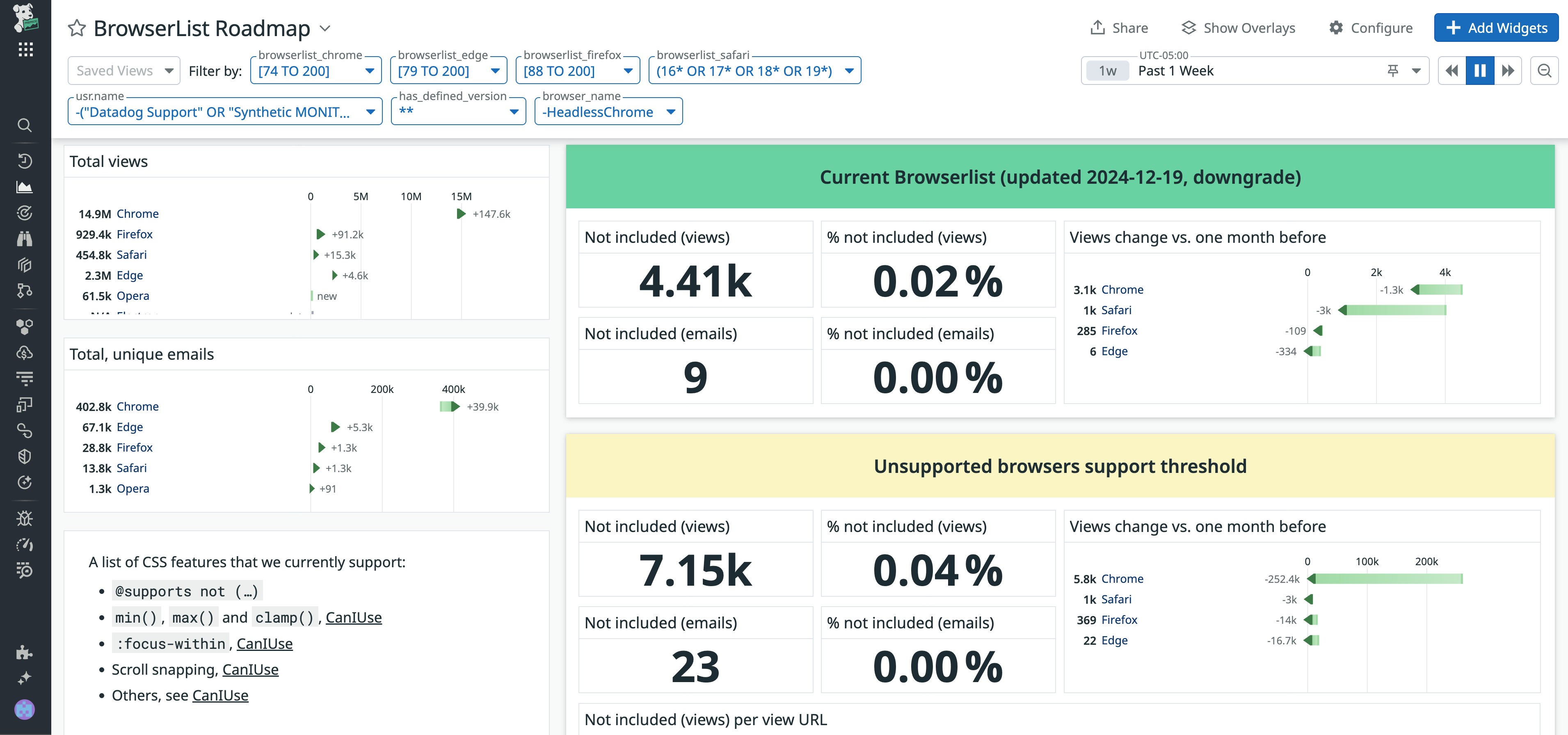
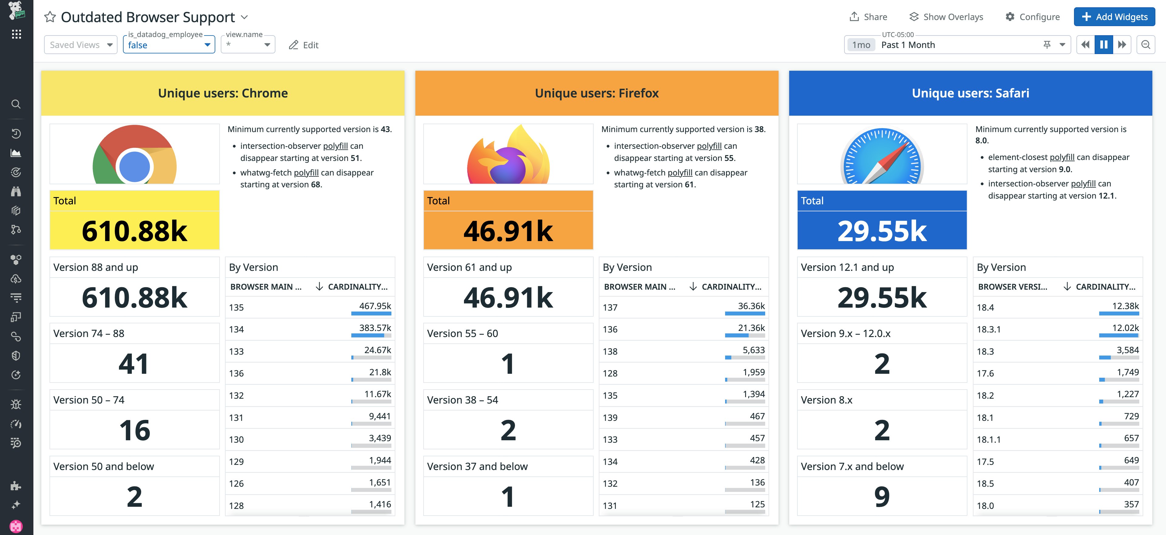
To improve the user experience, as well as our own developer experience, we proactively implement modern JavaScript (JS) and CSS features. Supporting the latest web design and development capabilities ensures that users won’t have to interrupt their own workflows or revert back to previous versions in order to use our application. Since older browsers may lack support for these features, we use RUM to help us understand browser usage (the number of unique users for each browser type) and user browser distribution (the number of users on each browser version). This data informs our rollout strategy, ensuring that new features are deployed only after enough users have transitioned to compatible browser versions.

RUM’s usage metrics—such as sessions by browser, device type, and application version—prompted us to expand browser support to include CSS container queries. CSS container queries enable you to apply styles to an element based on the size, style, or scroll-state of the container you’re using. By supporting CSS container queries, our application behaves dynamically. The content is presented as originally intended and remains readable, even when customers use different browser viewports or screen sizes.
Ensuring compatibility across browser versions
With granular insight into browser usage, RUM enables us to understand whether customers are using outdated browsers. This knowledge helps us determine whether we need to polyfill an API. A polyfill is a library that will implement native browser features into browsers that don’t yet support them, ensuring that the customer can still use our application and navigate our UI as if they were using a newer version of the browser.

Taking it a step further, RUM’s telemetry also enables us to understand when polyfills or backward-compatible libraries in our JS code are no longer necessary and can be removed. Because a user’s browser must download code whenever they use our application, polyfills and backward-compatible code can bloat code size, making the UI slower. Removing polyfills and backward-compatible libraries at the right time enhances UI performance.
Optimizing the UI across screen sizes
RUM enables us to understand and visualize the screen sizes customers use, whether it's on the web, mobile, or even a TV operating system, like tvOS or AndroidTV. Because Datadog users are more likely to have wider displays than the average internet user, we think of creative ways to use this extra screen space to enhance the UI. For example, we developed a “high-density” mode for our dashboards. In this mode, Datadog automatically reconfigures the dashboard’s layout according to the user’s screen size, making it readable, intuitive, and aesthetically pleasing on their device.

Knowing our users' screen sizes and device types also led us to develop TV mode for dashboards, where the dashboard automatically adjusts to fit the TV screen without the need for manual resizing. By accommodating a variety of screen sizes, we can ensure that we maintain an optimal user experience across a wide range of devices.
Bringing the user’s perspective into focus
Using RUM enabled us to better understand user needs and experience our UI and application from the user’s perspective. Because of this insight, we’ve been able to make engineering decisions that further optimize the user experience and prioritize building features that we know will have the greatest positive impact on the customer’s day-to-day workflows.
See our documentation to read more about implementing RUM and Session Replay into your own environment. You can learn more about Datadog’s engineering culture and take an in-depth look at different engineering solutions on our engineering blog.
If you don’t already have a Datadog account, sign up for a free 14-day trial today.


